Behind the Design: Inside Carley Donia’s Mind
By Lily Whorl
How lucky are we to have something that makes saying goodbye so hard?
The answer is very lucky and at the root of this goodbye is Carley Donia, our graphic design intern that became a staple to Planful.
This week marks graduation for Carley, a bittersweet moment for us as we can’t wait to watch her grow but wish she didn’t have to leave.
In honor of Carley’s time we wanted to get a little insight into her head.
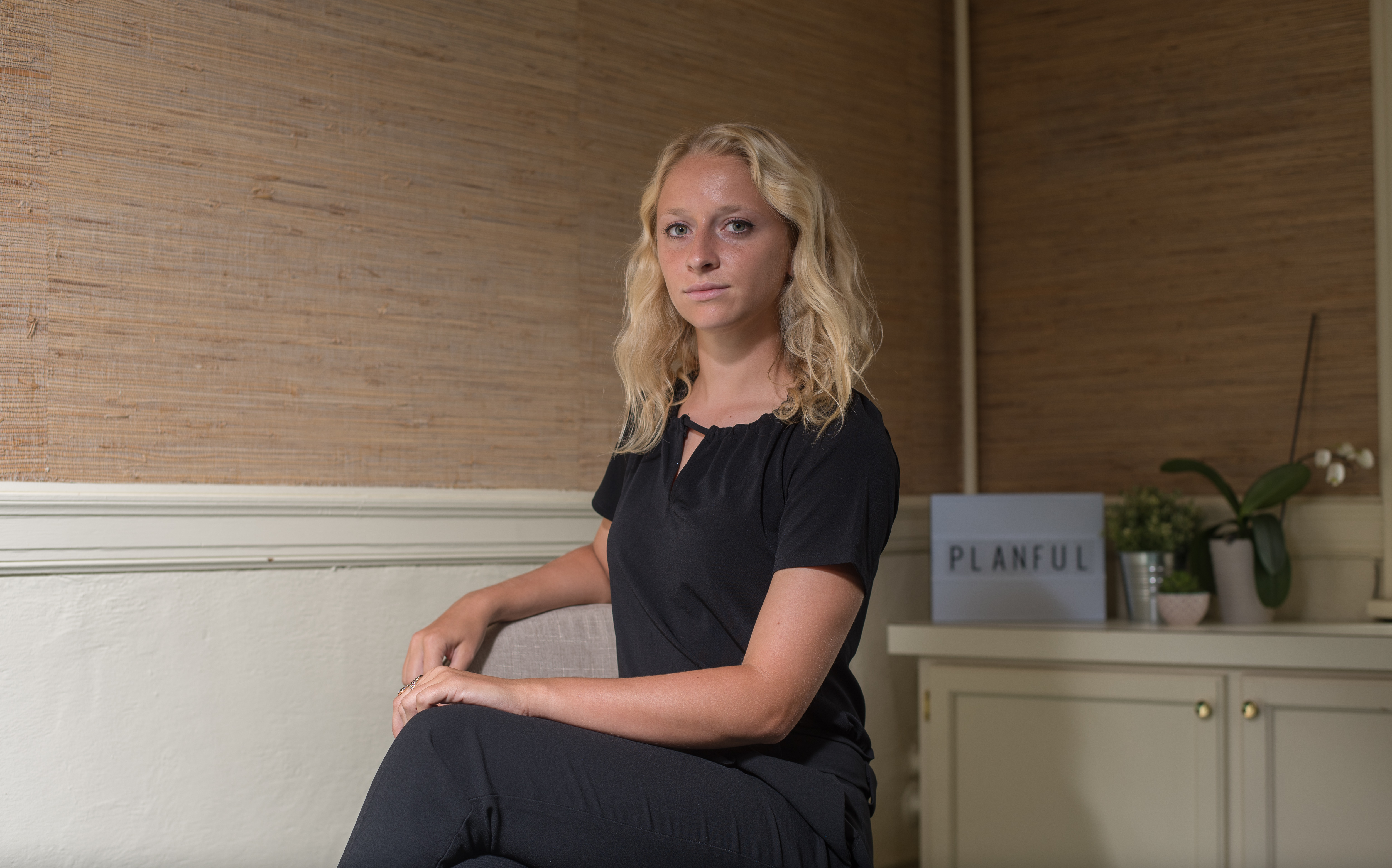
Planful: What made you get into the graphic design field?
Carley: My mom was an art teacher, so I grew up always making art, and I have always loved creating things. I was very involved in the art program at my high school, and the teachers I had were extremely influential to me. Because of them, I knew that I wanted to continue to focus on artwork throughout college.
However, I never felt that I fit into the fine art world and I knew that I didn’t want to make a living being a fine artist. So, I decided to try out graphic design, and I instantly fell in love with it.
Graphic design just makes sense to me. I love that it can be my creative outlet, but all my work can still be very organized and have a purpose (which is what I always felt was missing from fine art). I also love that I get to help people with graphic design. There are so many business owners who struggle, and I love that I can take their ideas and turn that into something real for them. It’s just a great feeling to see that my design work can put a smile on someone’s face and make a difference in his or her business.
P: Tell me a little about your graphic design process:
CD: Making logos is always an interesting process because every client/business has its own unique identity. However, there are always steps to making logos that I try to follow in every design.
1: Always reflect the company’s core values and overall mission — too many times I feel like there are logos that don’t tell you enough about the company. Simplicity works well for well-established brands, like Nike. But for some clients who are smaller businesses, their logos need to tell us more about their company. This can be done through the symbol, title, or tagline. Of course, it’s always necessary to not go overboard. No one likes an over-designed logo.
2: Have there be a purpose to the colors used — it’s always a nice touch when you can explain to a client why you used the colors that you did. It shows that you are invested in their brand and that there is meaning behind every single aspect of their logo.
3: Keep size in mind — a logo is something that will need to work on a microscopic scale, like a business card, and also an enormous scale, like a billboard. So when designing a logo, you should keep that in mind. Don’t include small elements that will get lost when the logo is shrunk down, but also make sure it is still attractive when it is blown up.
4: Put thought into the typeface — I always try to find a typeface that fits the client perfectly. There are so many fonts out there that there is no excuse to use a generic typeface. The font choice should be unique and meaningful to the company and its target audience.
P: Do you have a favorite project you worked on?
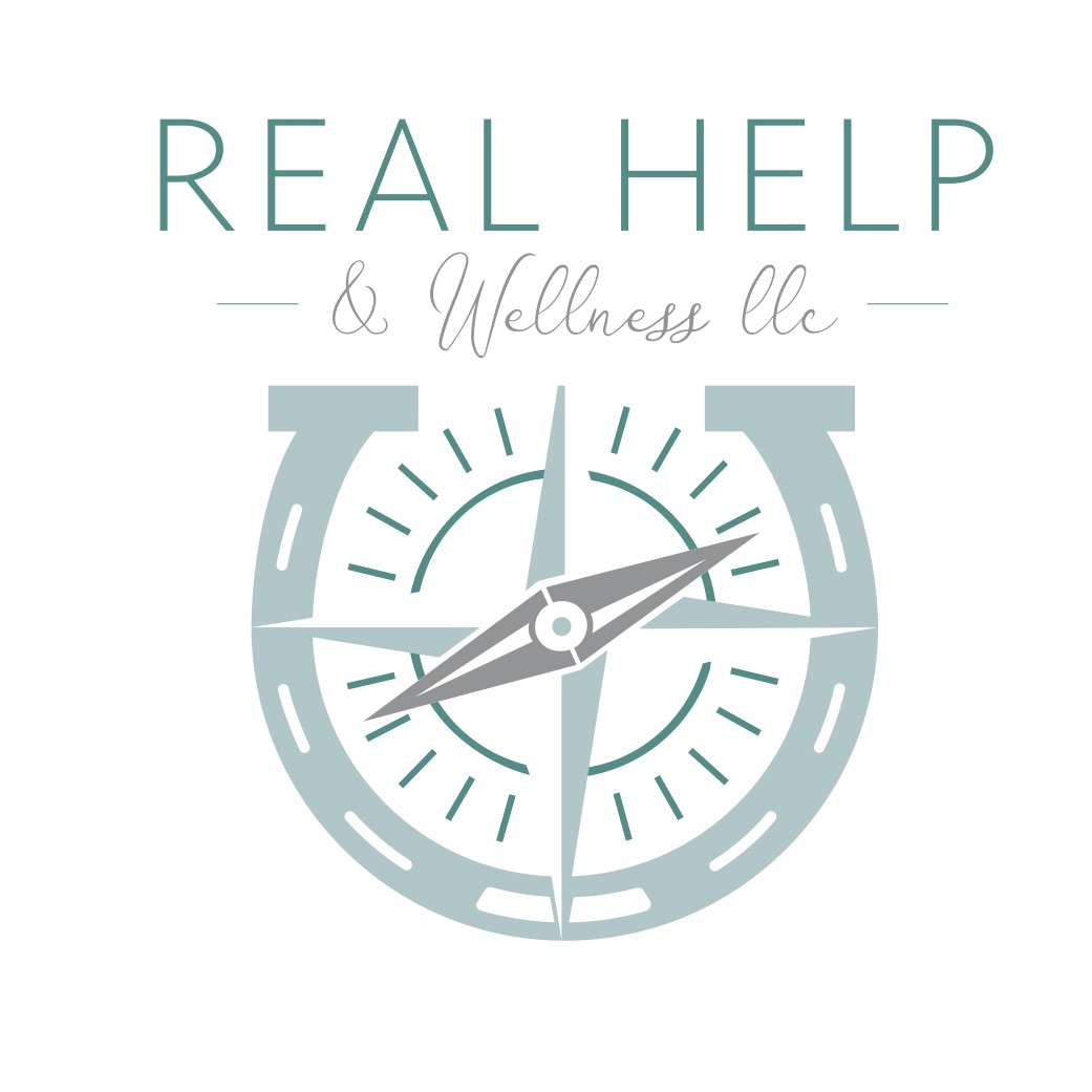
CD: My favorite projects are the ones that are different. I love when clients with really unique companies come to us for logos. Real Help & Wellness is one example. This client helps people find meaning and purpose in their lives and careers through different types of therapy. One of these types of treatment is called equine therapy, which uses horses as a form of therapy to help clients overcome life obstacles. I really loved this project because the client wanted to emphasize the equine therapy in the actual logo design. So, I got to learn all about this type of therapy and make a very unique logo for such an exciting business.
We’re lucky to have someone as talented as Carley on our team. If you’re looking to revamp your logo or need a brand new design, schedule a consultation with us here.

